Most advice about conversion starts at the page. The page is the second lever, not the first. When a test does nothing, it is almost always because the thing being tested was never the constraint.
01Product
Is there a reason to buy. The demand, the mechanism, the margin. No page rescues a product nobody wants at a price that cannot carry the cost of acquisition. Check this before anything else, because everything downstream is decoration if this is wrong.
02Page
Can they move through it. Structure and layout. What is above the fold, whether the button is reachable with a thumb, whether the sections arrive in the order the buyer's questions arrive. Design here is sequencing, not decoration.
03Copy
Do they understand it. This is communication, not writing. The hook, the mechanism explained in one sentence, the objection answered before it is asked. Most pages lose here and blame the traffic.
04Offer
Is it worth it right now. How the value is packaged: bundle, volume discount, gift, guarantee, subscription. Same product, different offer, routinely a completely different business.
Test in that order
Offer and copy tests move numbers in days. Layout tests move them in weeks. Button colour tests mostly move nothing. And fix one constraint at a time: if the product is the problem, a perfect page just gets you a cleaner read on the same bad number.
What a converting landing page actually contains
Our team pulled apart more than two hundred high performing landing pages across beauty, health, wellness and consumer electronics. The same blocks keep showing up, in roughly the same order. This is the checklist that came out of it.
01Above the foldOffer visible, benefits written on the product image, button reachable on a phone. Some brands shrink the header to buy the space.
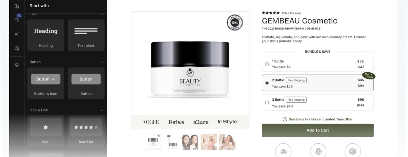
02The offerHow the value is packaged. Volume discount bundles are still the workhorse.
03Product imagesReal use, real scale, before and after. Not a catalogue render.
04TrustReviews, press, certifications, guarantee, payment icons.
05Trigger barShipping, guarantee, stock. Keeps the promise in view while they read.
06BenefitsOutcomes in the buyer's words, not features in yours.
07ComparisonYou against the alternative they already use. Table format wins.
08Problem to solutionName the pain first. Pre-sell pages are built almost entirely out of this one section.
09How it worksThree steps. Removes the "will this be a hassle" objection.
10Features and specsFor considered purchases. Skippable, but it must be findable.
11Ingredients or materialsThe transparency block. Doing a lot of work in health and beauty right now.
12FAQThe objections your support inbox already knows about.
13Final call to actionRepeat the offer, not just the button.
14Colour as a systemOne accent doing the work of the button everywhere on the page.
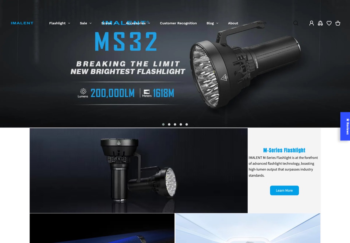
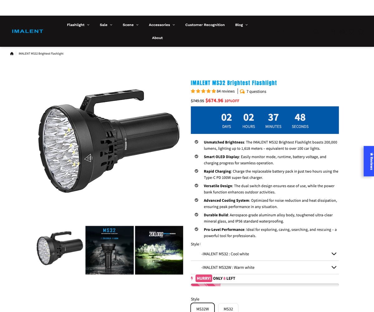
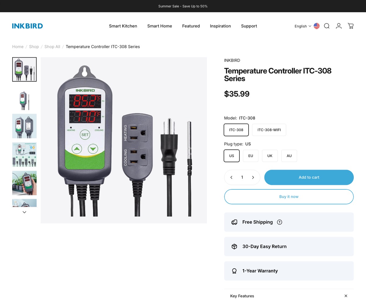
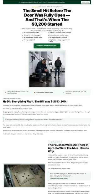
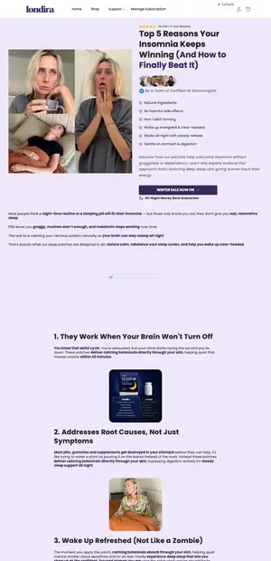
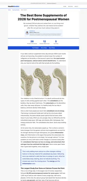
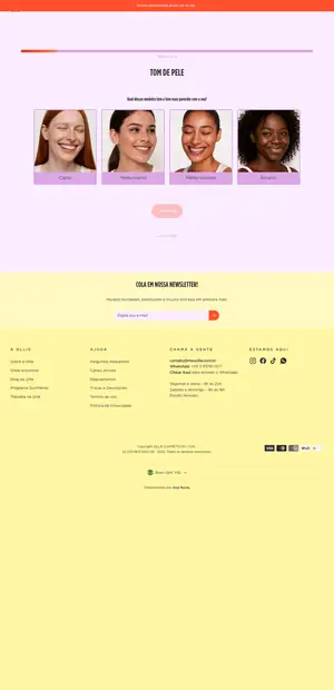
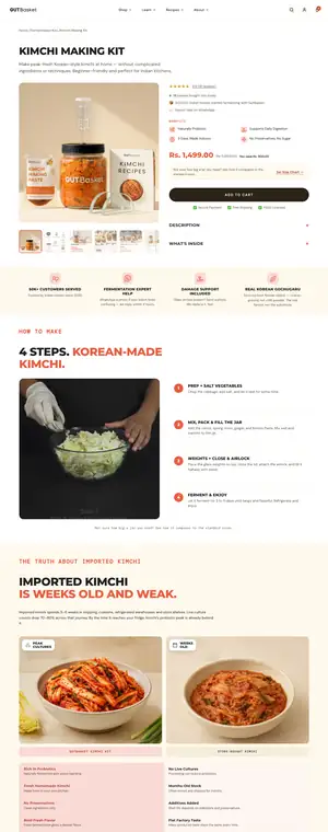
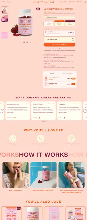
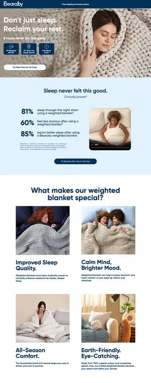
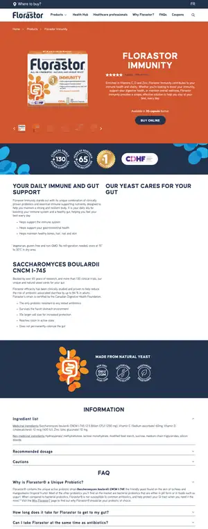
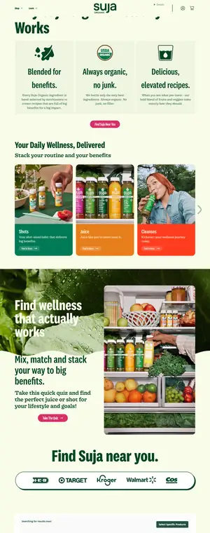
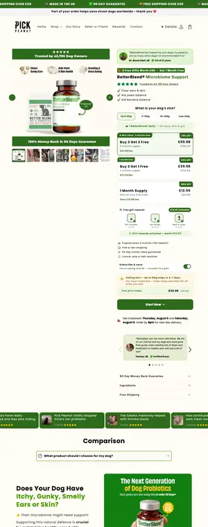
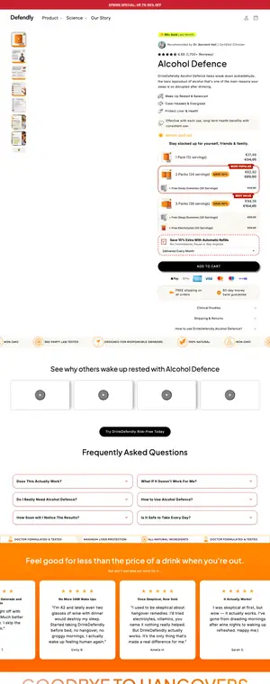
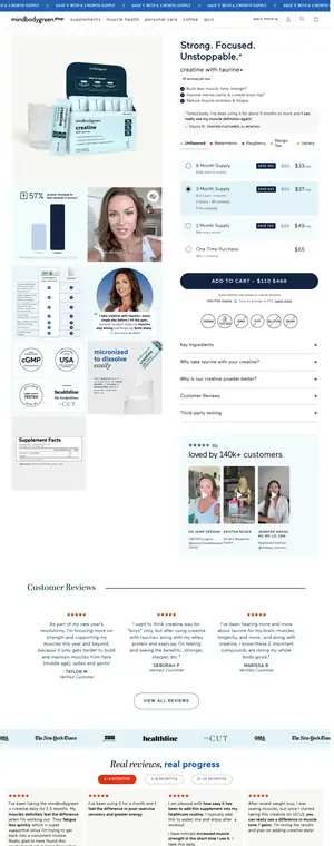
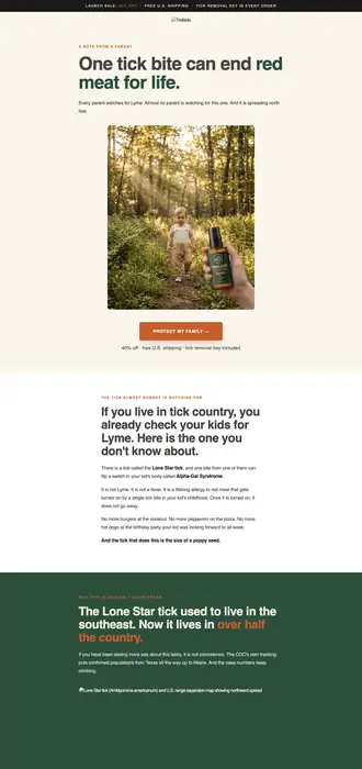
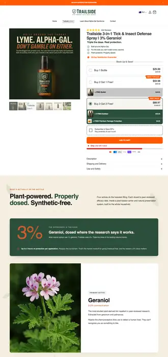
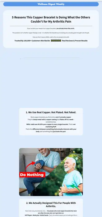
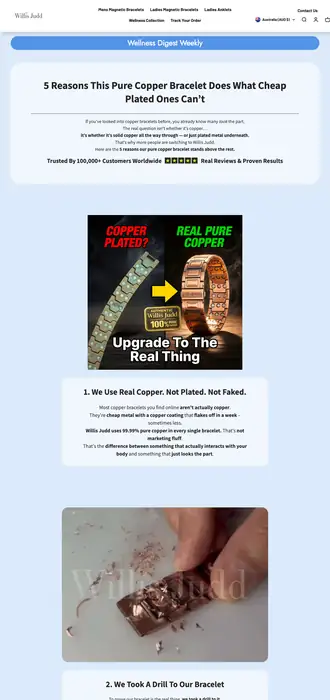
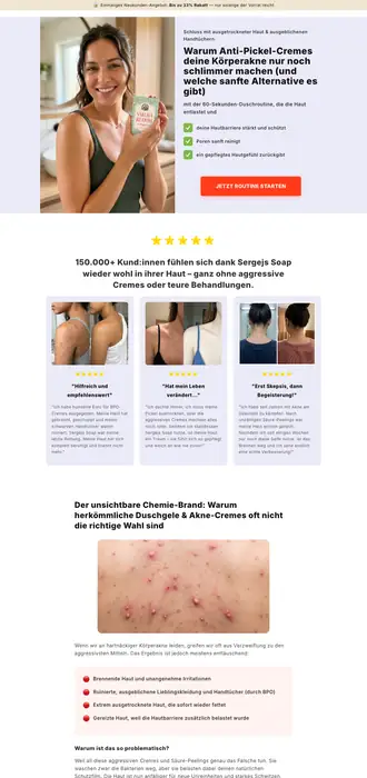
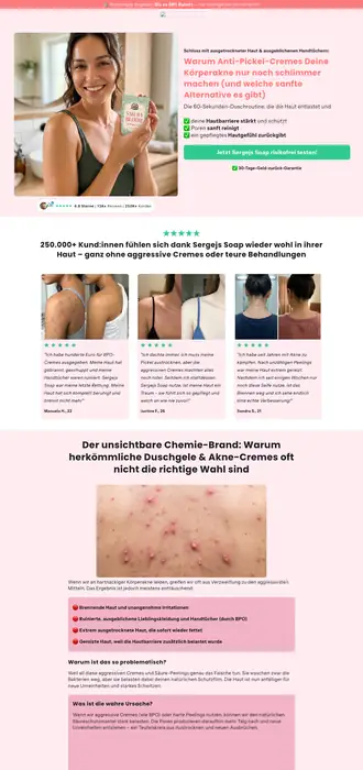
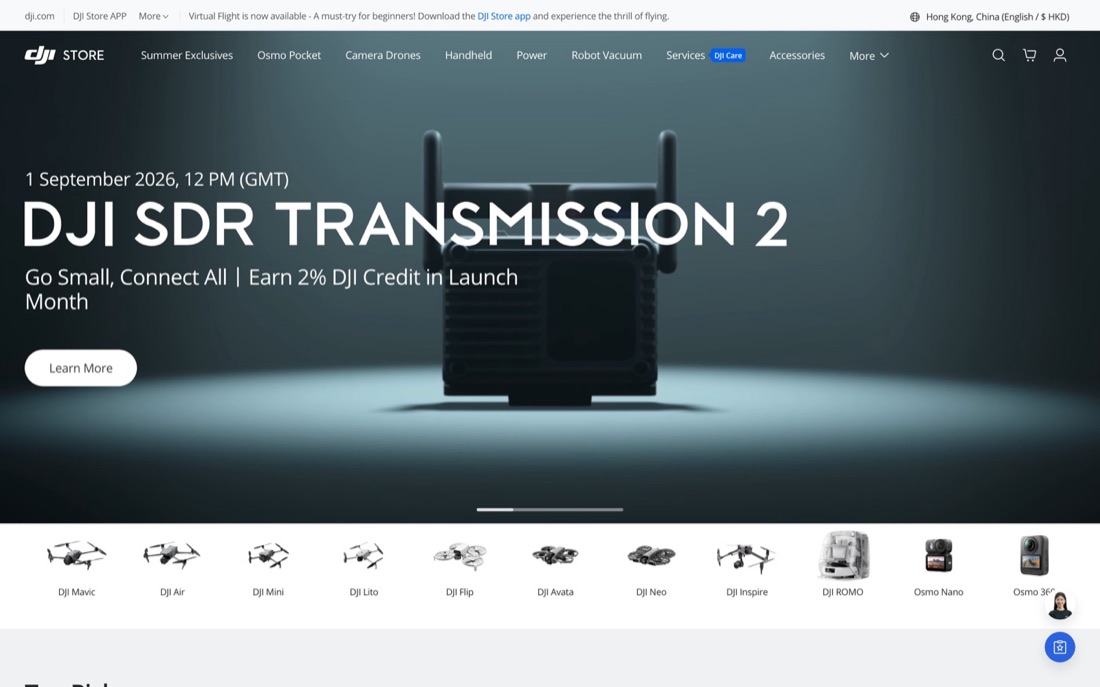
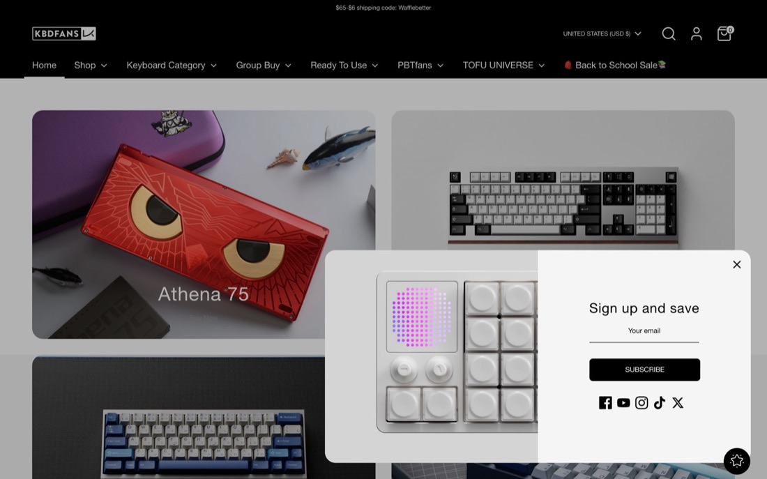
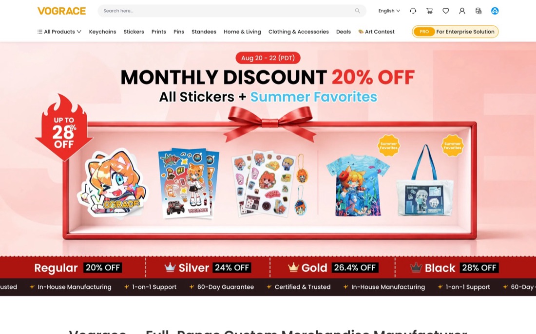
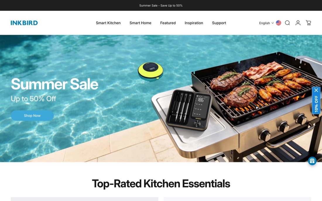
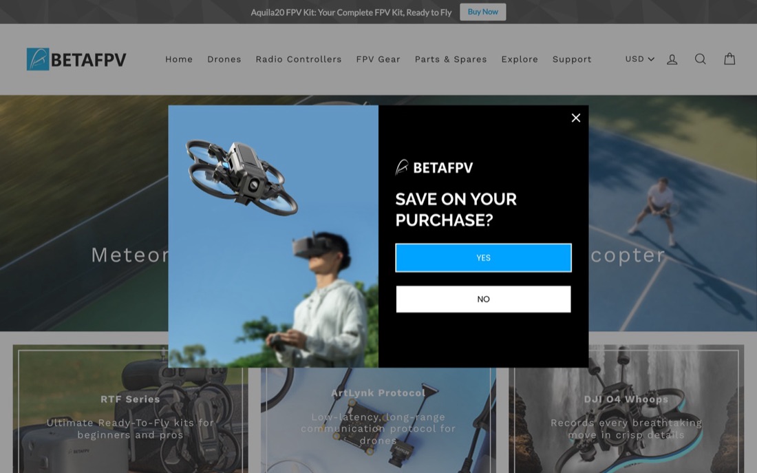
Eight pages from that research set, in eight different categories. Scroll past the branding and the same blocks are in the same order almost every time.
Eight pages from that research set are shown above, in eight different categories.
Where merchants actually point their tests
Every A/B test run through GemPages over ten months, about three hundred a month, 2,506 in total. Nearly half of them are aimed at landing and pre-sell pages, not at the product page and not at the theme.
Landing and pre-sell pages47%
The signal, and the gap
Serious paid traffic operators do not test the store. They test the page the ad lands on, and they run several angles at once.
And almost nobody is testing the checkout and post purchase moment, which is the part of the funnel with the least traffic cost attached to it.
The part everyone skips
Upselling is not one thing, it is four positions in the journey, and most stores only ever install the second one.
- Before purchase. Bundle and save on the product page, frequently bought together, build your own bundle.
- In the cart. Cart drawer offer, free shipping threshold nudge, progressive gift ladder.
- At checkout. Order bump, checkout extensions, warranty or protection add on.
- After payment. One click volume discount with no card re-entry, a mystery box at a price that is obviously a deal, a downsell when they decline the first offer, then the thank you page offer and the email sequence.
The last position is the cheapest revenue in the business. The hard part of a sale is the decision to trust you, and that is already done. A second offer thirty seconds later is a different question with a much lower bar. The reason it gets skipped is that it sits after the conversion event, so it does not show up in the metric most teams are judged on. It shows up in average order value, and average order value is what pays for the ads.
One rule: never break the original order. If the upsell asks for the card again, the offer is dead before it is read.
Where this is going
Today the angle lives entirely in the ad. Eight different ads, eight different reasons someone stopped scrolling, and every one of them lands on the same argument. The version worth building routes the click: the fear-led ad opens the fear-led page, the comparison ad opens the comparison, the deal-led ad opens the deal.
Building four full funnels used to cost four times as much, which is why nobody did it. With AI writing and building the versions, each extra angle is nearly free. The constraint moved from "can we build it" to "do we know which four to build". That is why a company like ours can exist now and could not have five years ago.
大部分关于转化的建议,一上来就讲页面。页面是第二个杠杆,不是第一个。一个测试跑出来没动静,原因几乎永远是:被测的那个东西,本来就不是瓶颈。
01产品
有没有理由买。需求、原理、利润空间。如果一个产品本来就没人要,或者价格根本扛不住获客成本,再好的页面也救不回来。这一条要放在所有事情前面,因为它错了,后面全是装修。
02页面
他能不能顺畅地走完。结构和排版。第一屏放什么、按钮在手机上大拇指够不够得到、各个板块出现的顺序是不是跟买家心里问题冒出来的顺序一致。这里的设计是排序,不是装饰。
03文案
他看不看得懂。这是沟通,不是写作。钩子、一句话讲清原理、在对方提出异议之前先把它答掉。大多数页面输在这一步,然后去怪流量。
04成交方案
现在买值不值。价值怎么打包:组合装、阶梯折扣、赠品、无理由退款、订阅。同一个产品,换一个方案,经常就是另一门生意。
要按这个顺序测
方案和文案的测试,几天就能看到数字变化。版式的测试要几周。按钮颜色的测试基本什么都不会变。而且一次只解决一个瓶颈:如果问题出在产品上,一个完美的页面只会让你更清楚地看到同一个糟糕的数字。
一个能转化的落地页,里面到底有什么
我们团队拆过两百多个跑得好的落地页,覆盖美妆、健康、大健康和消费电子。同样的板块反复出现,顺序也大致固定。下面这份清单就是拆出来的结果。
01第一屏方案要看得见,卖点直接写在产品图上,按钮在手机上够得到。有些品牌会把顶部导航压小,就为了省出这块空间。
02成交方案价值怎么打包。多件阶梯折扣到今天仍然是主力。
03产品图真实使用、真实尺寸、前后对比。不是画册渲染图。
04信任元素评价、媒体报道、认证、保证、支付图标。
05利益条包邮、保证、库存。让承诺一直停在视线里。
06利益点用买家的话说结果,不是用你的话说参数。
07对比你 对比 他现在正在用的东西。表格形式效果最好。
08从问题到方案先把痛点点名。预热页几乎整页都是由这一个板块撑起来的。
09怎么用三步。专门消掉"会不会很麻烦"这个疑虑。
10参数规格给需要认真比较的品类。可以跳过,但必须找得到。
11成分或材质透明度板块。在健康和美妆类目里,现在这一块特别顶用。
12常见问题你的客服邮箱早就知道的那些异议。
13最后一次行动召唤把方案再讲一遍,而不是只放一个按钮。
14颜色当作系统用整页只用一个强调色,所有该点的地方都用它。
下面是那批研究里的八个页面,八个不同类目。把品牌外壳拨开,几乎每一次都是同样的板块、同样的顺序。
上面那八个页面就是这批研究的样本,来自八个不同类目。
卖家真正把测试用在了哪里
十个月里跑在 GemPages 上的全部 A/B 测试,平均每月约三百个,总共 2,506 个。将近一半打在落地页和预热页上,不是产品页,也不是模板。
信号,还有缺口
认真投付费流量的人,不测店铺。他们测广告落到的那一页,而且同时跑好几个角度。
另一边,几乎没有人在测结账和付款之后的那一段,而那恰恰是整个漏斗里流量成本最低的一段。
所有人都跳过的那一步
追销不是一件事,是路径上的四个位置。大部分店铺只装了第二个。
- 下单前。产品页上的多件优惠、常一起购买、自选组合装。
- 购物车里。侧边车弹窗、包邮门槛提示、递进式赠品阶梯。
- 结账时。订单加购、结账页扩展、延保或保障服务。
- 付款之后。一键阶梯折扣且不用重新输卡号、价格明显划算的盲盒、拒绝之后的降级方案,再往后是感谢页的方案和邮件序列。
最后一个位置是整门生意里最便宜的收入。一笔成交里最难的是"决定信任你",而这件事已经完成了。三十秒之后的第二个报价,是另一个问题,门槛低得多。它之所以被跳过,是因为它发生在转化事件之后,所以不会出现在大多数团队被考核的那个指标里。它出现在客单价里,而客单价正是替你付广告费的那个数。
只有一条铁律:不要打断原来那笔订单。如果追销要求重新输一次卡号,这个方案在被读完之前就已经死了。
接下来会往哪走
今天,角度全部活在广告里。八条不同的广告,八个让人停下手指的不同理由,最后全都落在同一套说辞上。真正值得搭的版本,是让点击自己分流:讲恐惧的广告打开讲恐惧的页面,讲对比的广告打开对比页,讲折扣的广告打开折扣页。
以前搭四条完整漏斗,成本就是四倍,所以没人做。现在文案和页面都可以由 AI 生成,多做一个角度几乎不花钱。瓶颈从"能不能做出来"变成了"知不知道该做哪四个"。这也是为什么我们这样一家公司现在才成立得起来,五年前不行。