Shopify heatmaps: see where shoppers look, click, and give up
Analytics tell you a page is losing money. Heatmaps tell you where. A practical guide to the three maps that matter on a Shopify store, and how to turn them into tests that actually win.
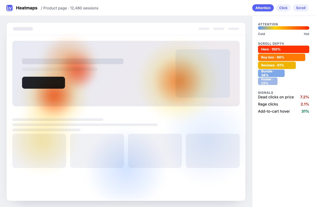
A conversion report can tell you a product page is leaking money. It cannot tell you why. Did shoppers never reach the add-to-cart button? Did they tap the price expecting it to open something? Did they read three lines and leave? Numbers describe the outcome. Heatmaps describe the behavior that caused it.
A heatmap aggregates what thousands of anonymous sessions did on a page and paints it back as color: hot where attention and clicks pile up, cool where nobody goes. On a Shopify store, three kinds earn their place.
The three heatmaps that matter
Click, dead-click and rage-click maps. Every tap, including the ones that hit nothing. A dead click is a shopper trusting something that is not a button, a product image they expected to zoom, a spec they expected to expand. A rage click is the frustrated triple-tap right before someone leaves. Both are the page quietly failing an expectation, and both are invisible in a funnel report.
Scroll-depth maps. How far down the page attention actually survives. If only 38% of shoppers reach your reviews section, that section cannot be blamed for not converting, it was never seen. Scroll depth lets you judge a block on whether anyone got to it before you judge it on whether it works.
Attention (hover) maps. Pointer movement, not just clicks. On desktop, where the cursor lingers is a decent proxy for where the eyes go, so you can see whether the headline, the hero image, or the price is doing the pulling. It is the heaviest signal to capture, which is why it tends to sit on higher plans rather than being sampled thin for everyone.
A number tells you a page is losing money. A heatmap tells you which pixel to fix.
Reading a page: healthy vs leaky
On a page that works, the heat clusters where you want the decision to happen: the headline, the product image, and a single obvious call to action. Scroll depth stays warm past the buy box. Dead clicks are near zero.
On a leaky page, the tells are consistent. Heat pools on a product image that is not clickable (people expect to zoom). The price shows dead clicks (people expect a size or bundle to open). Attention dies above the fold, so the proof and reviews below never get a chance. None of that shows up as anything but a low conversion number, until you look at the map.
From heatmap to hypothesis to test
Heatmaps are a diagnosis, not a cure. Their job is to turn a vague "the PDP underperforms" into a specific, testable hypothesis. The map says shoppers rage-click the non-zoomable image, so the hypothesis is "making the image zoomable will lift add-to-cart," and that is something an A/B test can settle.
This is the honest loop: a heatmap shows you where the friction is, an experiment tells you whether a fix actually helps, and only a change that beats the control gets shipped. Heatmaps without testing are decoration; testing without heatmaps is guessing what to test.
First-party, and consent-respecting
Heatmap data is behavioral, so where it lives matters. First-party capture, on your own store and in your own account, keeps it yours to inspect and export, and keeps it under the same consent rules as the rest of your analytics. Visitors who opt out are not tracked. Nothing is pooled into someone else's reports.
How GemBoss ships heatmaps
GemBoss captures click, scroll and attention maps first-party on every store it builds, next to the conversion and revenue numbers rather than in a separate tool. Because the same platform runs your experiments, a finding on a heatmap becomes a test in a click: see where shoppers give up, ship a fix, and keep only what wins.
See heatmaps on your store
We will build a store from your reference and show the click, scroll and attention maps live, then turn a finding into a test.
Request a demo →